
When it comes to making standard website for service/product oriented businesses there’s a couple of conversion optimization tips I wanted to share with you. These are going to be very design oriented and I will be sharing an example of a website I’m currently working on. Actually the site I’m working on now had a landing page – and I was asked to improve it – I wanted to show exactly what I did and share some common design elements I use in many of my sites and how I implement them – as well as provide the theory behind why they work.
Unorthodox Method #1: Call to Action in the Menu
The first thing I’ll start with is having a call to action in the top menu. Most people think of a menu as having a perhaps an item for some services, an about us, pricing etc. and a ‘Contact Us’ page. However, the menu is a great place to have a call to action. Here is a finance company I’m working on and note the ‘Apply Now’ button in the top right hand corner.

Having a call to action in the menu is very useful – as you can see in the example above the button has a border to bring attention to it and also has a cool hover effect.
In order to achieve this you’ll have to create a standard WordPress menu as you normally do – and then apply some custom CSS to the specific menu item. In case you’re curious how I achieved the effect above – below is the custom CSS code I used:
.menu-item-5887 a {
    border: solid;
    padding-top: 10px !important;
    padding-bottom: 10px !important;
    margin-top: 20px;
    border-radius: 5px;
    padding-left: 20px !important;
}

.menu-item-5886 { padding-right:25px !important; }

.menu-item-5887 a:hover { background-color:#77b34e !important;
    color:white !important;
    border-color:#77b34e !important;
}
You’ll need to replace the .menu-item-5887 with the ID number of your menu – which you can find by using Element Inspector as per the screenshot below:

Unorthodox Method #2: You Can Never Have too Many Call to Actions
We’re not finished with call to actions yet – In this particular example there is a call to action (‘Apply Now’) in the header menu – but also in the callout to the left.

You can never have too many call to actions – in fact here’s an unpopular opinion – you should have your application form on EVERY page. Your website footer should contain call to actions too.
Here’s an example of a site that does this:
As you can see there is a whole ton of footer content on every page – not just an application form, but also an email newsletter sign up call to action, as well as a call to action to download the brochure – the latest articles and even a trust section with awards.
Who says website footers have to be boring? Or that they should be short? If a user scrolls all the way to the bottom why not give them some additional call to actions, build trust and direct them to other parts of the site?
Unorthodox Method #3: The Downward Arrow (aka treating users like children)
Let me ask you this – have you been to a website and it was very difficult to navigate? Maybe the text was too small giving you a headache – or you couldn’t find what you were looking for. Perhaps all the ads slowed down the site – or the scrolling wasn’t smooth because the site messed with natural scrolling? Were you upset and irritated about this?
Now let me ask you another question – have you ever been to a site where everything was so simple to use to the point that you were offended that it was so simple – like you were being treated like a child?
Yeah – me neither.
Treating users like children may sound offensive but believe me – no one is going to get upset you made things easier than they should have been.
So I introduce you to the downward arrow – here is a video example below:
You may think having an arrow is overkill – however when I have a header (or hero) image that takes up nearly the entire page – I want the user to be able to easily:
- Know that there is more content below and
- Get to that content with the click of a button
You would be surprised how many people may not know there’s more content below – having an arrow gives them the psychological direction of where to go – it’s very subtle. You’ll note that this is a secondary call to action – ideally a user would click the primary call to action as described above (Apply Now).
But failing that the user can go down and learn more about the product/service and its benefits/features (that whole thing would take up another article of its own).
Unorthodox Method #4: Use Multi Step Forms
In this particular case study example that I’m using – I’m working on a loan website – the user is able to apply online. Having a multi step lead generation process is important – as it streamlines the sales process.
Multi step forms – which I have – in this case – created with Quform (a form plugin for WordPress that I highly recommend)
A multi step form can streamline your process – the trick though – is to get the data from the form if the user chooses to leave early.
The other benefit is no one likes to fill out big long boring forms – but a multi step form is fun (you never know what’s going to be around the corner) – also having a % complete bar at the top can help to set the user’s expectations.
Note: Use Quform and import the following form – www.quform.com/examples (click on ‘Steps’) – and then add the shortcode to your page to achieve the effect above.
Unorthodox method #5: Live Chat
One great feature to have on your site – if it’s practical – is the live chat feature. Here is how it looks like on my site:

The great thing about this feature is that it allows people to ask a question without having to leave all their details (which a user may not want to do because of time and also because the risk they see of being bothered in the future – it’s a lower risk way to engage).
One other cool thing to look at is the Facebook chat widget which you can see below (currently developing on one of my client’s sites)

The great thing about Facebook chat is that if someone messages you on there you have their details (you actually have their entire Facebook profile) – which can be very helpful. This is only useful in certain cases though and for certain industries – you wouldn’t have a Facebook chat widget on B2B website in most cases as Facebook is a bit more personal.
Unorthodox method #6: Use numbers and figures to state your case
One element which can increase conversion rate is #Facts – or numbers. Using numbers to help with your case – and presenting them in an engaging way is a great conversion strategy. The interesting reality is despite whether the numbers are true or not – people respond better to numbers. Here’s how I setup a section to show the benefits of getting finance:
As you can see there are two sections here – % of customers who said financing helping their business and also % of increased growth forecasts of businesses that used financing. But you’ll also notice they have a cool counting effect.
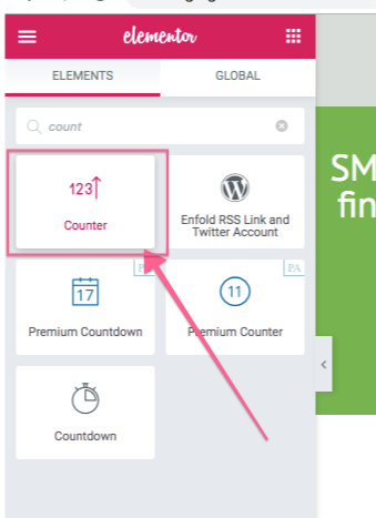
This can be achieved with Elementor’s ‘Counter’ widget:
Unorthodox Method #7: Nobody Likes Reading
There’s one rule you should go with – and this goes back to treating people like 5 year old kids – and that is making your content easily digestible. People do read bulky books all the time – but your job is to keep the reader engaged – the last thing you want is to have a whole large block of text for a reader to digest.
The consumer wants to be entertained, he wants the information in simple packets – he doesn’t want to think too hard.
While different products require different complexities of writing to sell there is one rule that will always remain constant – the easier you can make it for the user to digest the information you’re giving – the more likely they are to actually digest the information and be able to make an informed decision (or the decision you would like them to make).
For example take this section from the landing we’re studying:
Here I have 2 sections – one called ‘The different ways you can finance’ and one called ‘Why finance?’. Now I could have just had these as blocks of text but notice the different effects I use – like for example putting every section in its own block, having an icon for each block – and separating the sections with different background colours.
You may also notice that the first section has 2 columns while the next section has 3 columns – these are all graphic design tricks – the concept of contrast, having enough white space and changing things up while keeping the main elements in uniform (like for example I keep the heading fonts/sizes, theme colours and icon sizes the same).
This will take time to learn to ensure it looks good but also serves its purpose to guide the reader along.
Unorthodox Method #8: Copy, Copy, Copy
I can’t emphasize this enough – don’t try to start from scratch and try to be a Picasso revolutionary. In many cases I take a site that is doing things really well and I just copy what they’re doing – I change up the colours of course and the content – but in many cases I have a template for something that all ready works and just work off that – and I’m very transparent about that.
If you are in doubt – focus on copying things – and as you do you will learn why some things work the way they do.
Thanks for reading! I hope this has given you some ideas on how to approach your next project and how to setup elements to increase conversions.
Need help with your landing page or improving SEO? Contact Kosta at www.headstudios.com.au


